Violet Hour — The Sculptural Violet Facial Serum for a Deliberate, Detail-Led Skincare Ritual
Violet Hour — The Sculptural Violet Facial Serum for a Deliberate, Detail-Led Skincare Ritual
Couldn't load pickup availability

Violet Hour — The Sculptural Violet Facial Serum for a Deliberate, Detail-Led Skincare Ritual
✨ Small bottle. Distinct point of view.
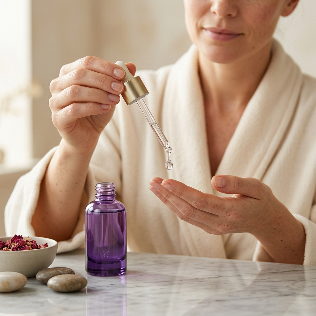
Violet Hour is the expressive centrepiece of the collection: a violet glass silhouette, a champagne-coloured collar and an ivory dropper bulb. Its cylindrical form is compact and composed, with colour that appears lighter near the shoulder and deeper towards the base. There is no front-facing logo to interrupt that progression. The design asks you to notice the object itself.
This is a different kind of statement from a crowded vanity. One bottle, a clear surface and a moment of attention can be enough. Violet Hour brings the precision of a dropper presentation together with a colour palette that moves between pale lavender and deep plum, allowing it to feel soft in daylight and more dramatic under evening light.

Detail dossier: the silhouette
The rounded shoulder leads into a short metallic collar rather than an elongated ornamental neck. Above it, the ivory bulb adds a quiet contrast to the darker bottle. Below, the substantial-looking base gives the silhouette a defined endpoint. From the close-up perspective, the meeting of these surfaces becomes the story: soft colour, reflective metal and the clean line of the dropper.
Detail dossier: the ritual
A dropper is a reason to slow down, not a reason to guess a dose. Follow the confirmed product label for how much to use and where the serum belongs in your routine. Keep the tip away from your face and fingers, return it to the bottle carefully and secure the closure after use. The imagery focuses on the gesture of dispensing into fingertips, without turning that gesture into a formula-specific prescription.

Questions worth asking
Does the violet colour mean a particular active ingredient? No. It is part of the packaging direction and does not establish the formula. Does a serum automatically suit every skin type? That cannot be determined from its format or appearance; use the confirmed ingredient and suitability information. Does the dropper indicate a measured dose? Not unless the finished packaging and directions explicitly say so.
What makes the presentation distinctive is easier to see: the restrained cylindrical profile, the contrast between the ivory bulb and violet body, and the decision to leave the front visually uncluttered. These are design details, not claims about absorption, brightening, wrinkle reduction or clinical performance.
The anatomy of a considered detail
01 / The ivory accent. The pale bulb is the smallest colour element in the composition, but it changes how the bottle is read. Against the purple glass and warm metallic collar, it creates a soft endpoint rather than another reflective surface. The result is a three-part silhouette with a clear beginning, middle and base.
02 / The metallic interval. The champagne-coloured collar separates the bulb from the glass. Its short proportions keep the bottle from appearing top-heavy, while its reflective finish catches a narrow line of light. It is a restrained decorative moment, not an ornamental feature competing with the rest of the design.
03 / The violet depth. The colour appears lighter towards the upper body and richer near the bottom. That transition brings dimension to a simple cylindrical form. In a pale setting, the upper glass feels airy; against a deep plum background, the outline and metallic collar become more pronounced.
A ritual defined by attention, not excess
Set the bottle down before opening it, rather than balancing it among other products. Give the closure somewhere clean to return to and keep the surrounding surface free of unnecessary items. A tidy setting makes the small dispensing gesture the centre of the moment. It also echoes the design of the bottle itself: a few elements, each with a clear role.
There is no need to turn the serum step into a complicated performance. The visual idea is a measured pause within your existing routine, not a claim that adding more layers will give a better result. Use the confirmed directions to decide the amount and frequency, and let the uncluttered presentation be an invitation to approach the process with the same restraint.
Choose the mood that feels like you
The quiet composition: place violet beside pale grey or lavender and use soft, indirect light. The colour remains visible without dominating the room. The expressive composition: use a deep purple surface and a sharper highlight to emphasise the glass and metallic collar. The everyday composition: let the bottle stand beside one neutral accessory, with enough space for its full outline to remain visible.
Violet Hour is a visual choice for someone who appreciates precision but does not want their shelf to feel clinical. The dropper silhouette is familiar; the colour gives it individuality. Together, they create a small object with a distinct presence, one that rewards a closer look without relying on a large name across the front.
From lavender calm to plum drama
Pair the bottle with pale linen for a quieter scene, silver-grey stone for sharper contrast, or deep purple acrylic for a more editorial composition. The gift image carries the same violet palette into a fitted presentation box. That image shows a styling possibility, not an automatic inclusion in the order. Violet Hour is for the person who appreciates a little precision in the ritual and a little individuality on the shelf, without needing either to shout.