Coral Interval — A Sculptural Eye Gel for the Smallest, Most Considered Moment in Your Routine
Coral Interval — A Sculptural Eye Gel for the Smallest, Most Considered Moment in Your Routine
Couldn't load pickup availability

Coral Interval — A Sculptural Eye Gel for the Smallest, Most Considered Moment in Your Routine
🪞 A closer kind of attention
You notice the smallest things when the room becomes quiet. The light at the edge of the mirror. The line where your hair meets your temple. The moment your hands stop moving quickly and begin moving deliberately. Coral Interval gives the eye-care step its own identity: intimate in scale, expressive in colour, and entirely different from another tall bottle on the shelf.
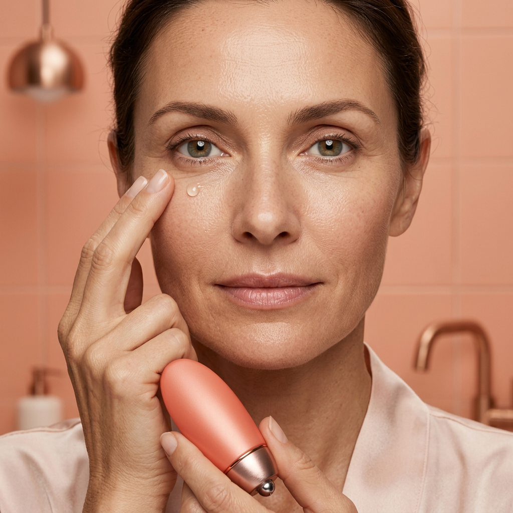
The coral oval is the starting point. Its curved outline sits between a pebble and a piece of modern sculpture, finished with a warm copper-toned base. There is no oversized name across the front. The design is recognisable through shape rather than decoration, with a narrow metallic transition that rewards a closer look.

The portrait, not the promise
Our eye-area imagery leaves skin looking like skin. Fine texture, the shape of the orbital area and natural expression remain part of the picture. This is not a before-and-after story, and the photographs are not presented as evidence of a change in dark circles, puffiness or lines. The focus is a thoughtful gesture and the personal space around it.
There is something reassuring about a routine that does not ask you to scrutinise every feature. Place the things you need within reach, give yourself adequate light and allow the eye-care moment to be one small part of the day, not an assessment of your face.

Three distances from the same object
From across the room: a clear coral shape against a pale surface. The rounded body has enough colour to hold its own without a collection of matching accessories. Leave a little space beside it rather than surrounding it with taller containers.
At the mirror: the relationship between the soft-looking body and the reflective base becomes more apparent. Warm light makes the copper detail feel richer; indirect daylight brings out the distinction between the two surfaces.
In the hand: the compact outline is the centre of the composition. The campaign follows fingers, reflection and movement, rather than making the same frontal packshot do every job. That change of perspective gives the object a more personal character.

Make the step precise, not complicated
Choose your eye-area products by their confirmed formula information, not by the colour of the packaging. Read the finished directions for the amount, placement and frequency, and whether an applicator is intended to contact skin. Keep product out of the eye itself. Do not infer a cooling treatment or massage instruction from a metallic-looking component.
The photograph explores a fingertip gesture, not a prescribed dose. It also does not suggest that an eye gel replaces rest, sun protection or the rest of your chosen care. A small step deserves clear instructions as much as a larger one does.

A warm object in a cooler room
Try coral beside chalk-white stone, muted terracotta or a single copper reflection. Against grey, the colour reads more vividly; against warm ivory, it becomes quieter. A folded neutral cloth can soften the composition without turning the space into a matching set.


The final frame
The boxed presentation carries the coral palette into a fitted setting, giving the oval its own space rather than adding printed ornament. Gift packaging is shown as a presentation idea; included contents must be confirmed in the final listing. Formula-specific benefits, ingredients and suitability should be checked against the finished product information before purchase.

Coral Interval. A small form, with a point of view all its own.