Amber Dew — The Honey-Amber Facial Essence for a Thoughtfully Layered Skincare Ritual
Amber Dew — The Honey-Amber Facial Essence for a Thoughtfully Layered Skincare Ritual
Couldn't load pickup availability

Amber Dew — The Honey-Amber Facial Essence for a Thoughtfully Layered Skincare Ritual
☀️ A study in warm light
Some objects change the mood of a room without asking for more space. Amber Dew takes that idea into the skincare ritual. Its honey-amber colour catches the light, its rounded rectangular shape gives it presence, and its champagne-coloured cap keeps the composition clean. The result is an essence presentation that feels luminous and architectural rather than decorative for decoration’s sake.
Chapter 01: The colour
Look first at the edges. The amber deepens around the rounded shoulders and softens through the centre, creating a sense of depth even against a plain ivory background. This warm colour story is a visual choice, not an ingredient claim: the name does not mean the formula contains honey, amber extract or a particular botanical. What it offers visually is a richer alternative to an anonymous clear bottle.

Chapter 02: The proportions
A broad, clear-looking base anchors the upright shape. The shoulders curve inward gently, meeting a short rounded cap rather than a tall decorative closure. There is no large front logo interrupting the surface. Viewed from a distance, the bottle reads as a single warm shape; up close, the transitions between cap, shoulder and base become the details worth noticing.
Chapter 03: The moment between steps
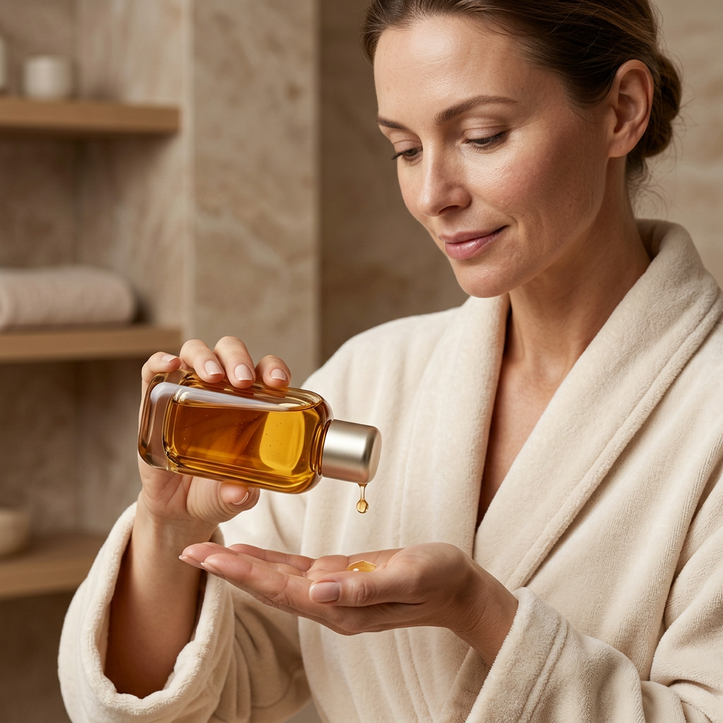
Think of the essence step as a chance to be deliberate about your routine, rather than an instruction to add more products. Set the bottle on a stable, dry surface, keep the opening clean and close it after use. The correct amount, application method and position alongside other formulas should always come from the finished product directions. A photograph of a palm application is an illustration of a ritual, not a substitute for those directions.
If you prefer a small routine, allow each confirmed product to earn its place. If you enjoy layering, pay attention to the instructions and compatibility information supplied with each formula. Amber Dew’s visual identity is designed to sit comfortably between other steps without turning your shelf into a wall of competing colours.

Chapter 04: The setting
Ivory travertine brings out the warmth of the bottle. Orange glass creates a more saturated editorial mood. A clean pedestal lets the curved base and rounded cap do the work on their own. Together, these settings move from the everyday bathroom to a more expressive still life while preserving a recognisable product identity.
Chapter 05: Follow the light around the bottle
The design becomes more interesting as the viewing angle changes. From the front, the rounded rectangle reads as a warm, uninterrupted field of colour. At an angle, the outer edges appear darker and the broad lower section becomes more apparent. The shoulders curve towards the closure without a sharp corner, keeping the silhouette fluid even though its overall shape is structured.
The short metallic cap creates a pause at the top of the bottle. Its simplicity matters: a more elaborate closure would compete with the amber body, while a matching amber cap would make the silhouette less defined. Here, the visual contrast separates the two parts cleanly. It is a small detail that helps the design remain recognisable in a close-up, a bathroom scene or a wider still life.
Chapter 06: A little space between the steps
A thoughtful routine leaves room to notice what you are doing. Before reaching for the next product, place the bottle on a stable surface, check the directions and give yourself enough time to follow them. You do not need a full dressing table to create that sense of order. A clean corner of the vanity, a folded cloth and the products you have actually chosen to use can be enough.
The collection’s application scene explores that quieter interval through the simple gesture of a bottle and an open palm. The focus is on attention rather than speed: an intentional movement, a clear surface and no unnecessary accessories crowding the frame. Let that be the inspiration for the atmosphere, while using the finished label to guide the application itself.
Chapter 07: Build a warm colour composition
For a pale, sunlit setting, pair the amber bottle with chalky ivory and natural-looking stone. For a richer composition, introduce a translucent orange dish and a deeper backdrop, allowing the golden outline to remain visible. For an uncluttered everyday arrangement, keep the bottle beside a neutral towel and leave an open area around it. Each version tells the same warm story with a different level of drama.
Amber Dew is particularly at home in a setting where objects feel collected rather than coordinated down to the last detail. A curved bottle beside a rectangular tray, a reflective cap against matte stone, warm colour against a pale wall: the interest comes from those contrasts. You do not need every item to match. You need a few clear relationships that make the whole space feel considered.
Before you choose
Colour does not establish scent, viscosity or performance, and the photographs should not be read as evidence of a particular ingredient concentration. Refer to the confirmed ingredient list and product label for formula-specific information. The boxed image is a gift-styling presentation; any included packaging must be stated separately. Amber Dew is an invitation to bring more intention to the space between the steps, and more warmth to the objects you choose to keep there.